Giving good talks - some advice
by John Conway, June 2002![]()
You have been there, sitting in a talk, not following it,
and blaming yourself for it...but could it be that
the person giving the talk just didn't know how to give a decent talk?
Preparing and delivering good talks is THE key to getting
a good job in this field.
What makes a good talk good? Here is some advice which may help you in
preparing a kick-ass
talk. Though the emphasis here is on conference talks, almost all of this
advice holds for CDF group
meetings as well.
1. Who is your audience?
Your first
task is to figure out who is going to listen to your talk, and what you
want them to carry off
with them. Are you selling the excitement and the adventure, or trying
to convince difficult critics you
got it right? Do the need or want nitty gritty details or just the highlights
and the conclusions?
For young scientists, especially, this can be THE
most difficult hurdle to overcome in giving a good
talk. You have worked for months or years, you are intimately aware of
and indeed in love with all
the details, and you want to share it. In a conference talk, you must
resist this temptation. And in
CDF group meetings, the details may be important but without the context
they are not useful.
Start at the beginning and
remind yourself why, exactly, you and your colleagues are doing the
project. Make that your first slide...then telling how you did it, and
what the results are will flow
naturally.
Then think
again about who is actually sitting there in the audience, what their
questions might be.
Are there theorists? Grad students? Ancient ("distinguished")
professors? Make sure you give them
some handles to grasp your subject. On every slide the basic message of
that slide should be clear.
Tell them what conclusions to draw, and then they will draw those conclusions.
When in doubt,
pitch your talk as if to a first-year grad student...
2. Go high tech...mostly
Hand-written
notes surrounding plots xeroxed onto plastic, handled until the finger
grease smudges
are darker than the shading of the histograms...yecchhh!
Things have
come a long way. Electronically produced presentations using LaTeX, Powerpoint,
and
other programs, projected with an LCD projector, are much more accessible
to the audience, easier
to prepare, transmit, and modify, and won't end up sliding off the table
into a random pile on the floor.
Programs like
Powerpoint allow you to put in lots of fancy animation, which can be used
to good effect,
but which can also be annoying if used for something other than to enhance
the impact of the presentation.
For example, don't make text/plots "appear" or "fly in" unless there is a good reason, such as a new
thing flying in on top of an old one.
Fonts are fun,
but can also be a source of annoyance. You really, really don't want to
annoy your audience,
either. Ditto for colors, and boxes, and clip art, and anything else your
office mate thinks is annoying.
(I was once at a talk comparing various SUSY models, and the speaker put
a photo of a supermodel
in swim suits on every slide, with little word bubbles coming out of their
heads...I think this guy left the
field.)
There are indeed many tools
to learn. Nearly all our plots, for example, start out as postscript,
but end
up in some other form which can be imported into a graphics program. In
the process, these can be
rendered illegible or worse. Make sure you understand the graphics format
you are using, and the
program you are using to convert from one format to another. Spend a little
time learning the finer
points of programs like Adobe Illustrator (an indispensible tool, by the
way - get your boss to buy it)
and you can make compact, high-resolution, transportable plot images.
3. Make it readable!
Now we come
to one of the biggest problems in our field: making decent plots. Consider
the following
two plots. Which one do you want in your talk?
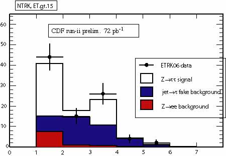 |
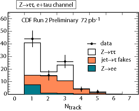 |
| The bad plot
|
The good plot
|
There are many other ways to make plots look bad. In general you should try to:
- use large, clear axis numbering, labels and titles
- use pastels or mixed colors rather than primary colors
- always label your axis
- leave off anything that it isn't adding information (get rid of drop-shadow boxes, etc.)
- make it clear what the plot is about - don't rely on auxiliary text
In addition
to making the plots readable, the TEXT must be readable too. Far too often
speakers put such small font on the slide that it is not legible. As a
rule of thumb, print
out your slides, and measure the font size with a ruler. It it's less
than about 4 mm, it
will not be readable from the back of the room, and should be increased.
You can't fit
what you want to say if you make the font bigger? Then read the next
section...
4. A picture is worth 1000 words
On one end
of the bad talk spectrum is the kind that is all text: block after block
of paragraphs,
read to you by the speaker. Then the speaker will switch to a page with
just a plot on it, with no
explanatory text. Then it's back to the block paragraphs.
While this
represents an extreme, it does actually happen and it's not pretty. Very
often, though,
one encounters something nearly as bad: a talk where the plots are reduced
to near-icon size,
lots of big, clear, full sentences describing them on the page.
Don't do that.
Your plots
should take up the vast majority of the area of your slides. If it isn't
about 2/3 of the
area, cut down the text and make the plots larger. In cutting down the
text, pare it to the bone,
then boil the bones. Get rid of articles, verbs, adjectives...anything
that is not the essence of
the information of what you are trying to say. Really, you don't need
or want all those words!
Also, do you
really need a CDF Run 2 logo and that of your institution on every page
of your talk?
It takes up a lot of area...
Think about
sitting in a talk . You want to see the plots, understand what they are
saying, and
get the message from the speaker, who should be adding what's
not on the slide itself. If
it's already written on the slide, you stop listening to the speaker!
5. Less is more
As noted above,
you love your analysis. You have lived it for the past fourteen weeks,
through
sleepless nights, hours, and meetings. You know
every detail, and think it's pretty cool. Clearly
everyone wants to know all the details, right?
What your audience
wants to know is why you did it, a bit about how you did it, and what
the
result was and what happens next. (And whether it's the best anyone ever
did!) Keep it to that,
and you will have a winning talk. Add in a bunch of boring details and
they'll start looking
at the parallel session schedule for a better talk to go to.
Keep it simple
and to the point!
6. Spend the time
Sure, you could
go to the web, grab someone else's talk, change a few fonts here and there,
update a plot or two, and presto! You have yourself a new talk!
Properly done
and researched, a talk will typically take you a MINIMUM of a factor of
40 in
time compared to the length of the delivered talk.
A 30 minute talk takes at least 20 hours of
solid prep time. Think about every slide, what you re going to say, and
whether this is the
best way to organize the material. Get hold of the original plots (you
will need the eps to
write the proceedings!), make the plots look nice, read the CDF notes,
and design the talk
yourself.
No
doubt you will oftentimes find yourself giving a talk which someone else
from CDF gave
recently. Naturally you will use the same plots, and probably a lot of
the same text and ideas.
Do your best, though, to make this your talk, and bring to it
your unique perspective.
7. Practice!
Maybe it's
clear to you what you mean, but is it clear to everyone else? The only
way to know
before delivering your talk is to practice what you want to say in front
of yourself, and then
in front of other people. You actually use different parts of your brain
to speak and to listen,
and you might be surprised to hear what you are actually saying.
The only solution
is to practice, practice, practice, with whoever you can get to listen.
Listen
to what your practice audience says, too, and make changes, because chances
are they are
right.